Let’s find the use of typography and leading lines in a magazine spread.
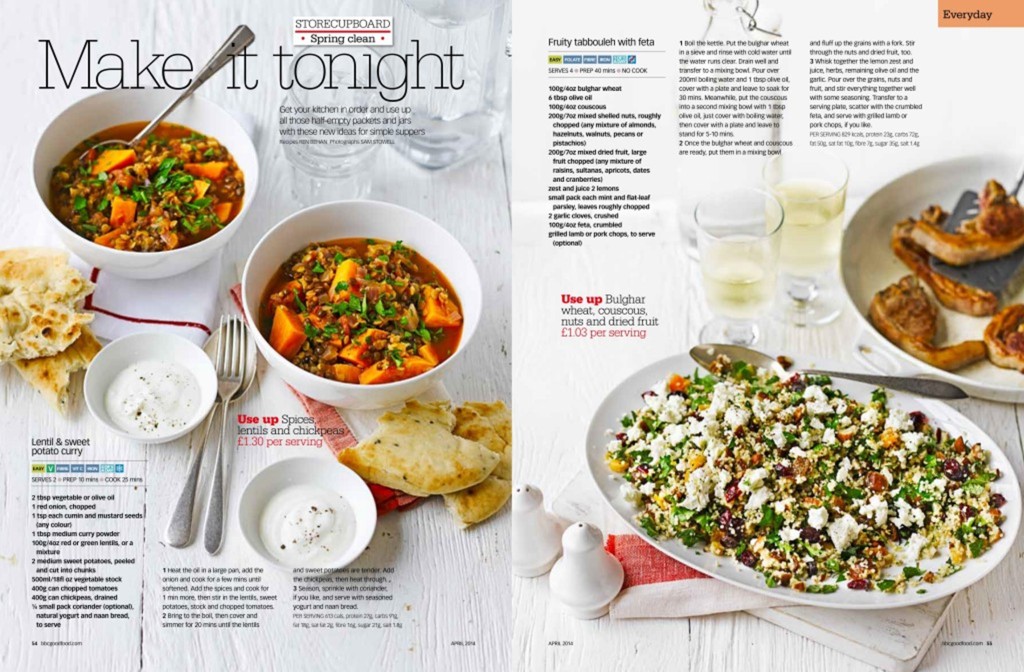
This layout has made good use of typography to create a great design. It also uses great photographic elements to make an interesting composition.

The spread uses a mixture of Modern and Slab Serif typography to create proximity and contrast. It keeps the eyes moving but, breaks the information down into relative groups. You can tell it’s modern by the clean lines and the slab serif by the thickness and tails on the edges.
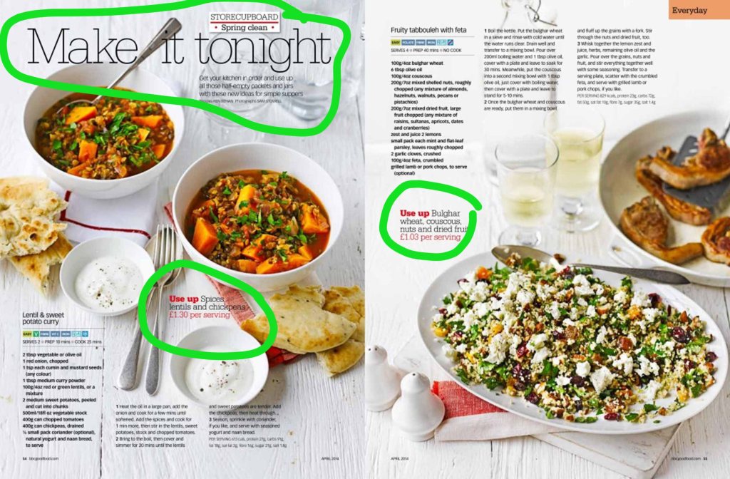
The two contrasting typefaces here break the paragraphs from the titles. The Serif Slab typeface draws your eye in and they use a modern typeface have clean lines and no tails on their edges.
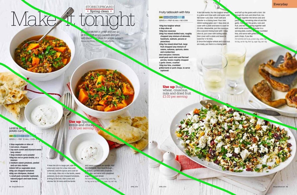
The leading lines in this spread are at an angle and the eye follows the food with type in the corners.
I used the leading lines in the same direction, I tried to stay with the theme of food. I left enough negative space for the text to be written in.
